Most people have realized by this point that Windows 8 lacks a traditional start menu. The reaction to the new start screen has been very mixed, and I find myself of the “what in the world were they thinking?!?!” side. However, there is hope!
I’ve tried a couple different start menu replacements during the beta of windows 8, but in my opinion, only one lives up to daily use.
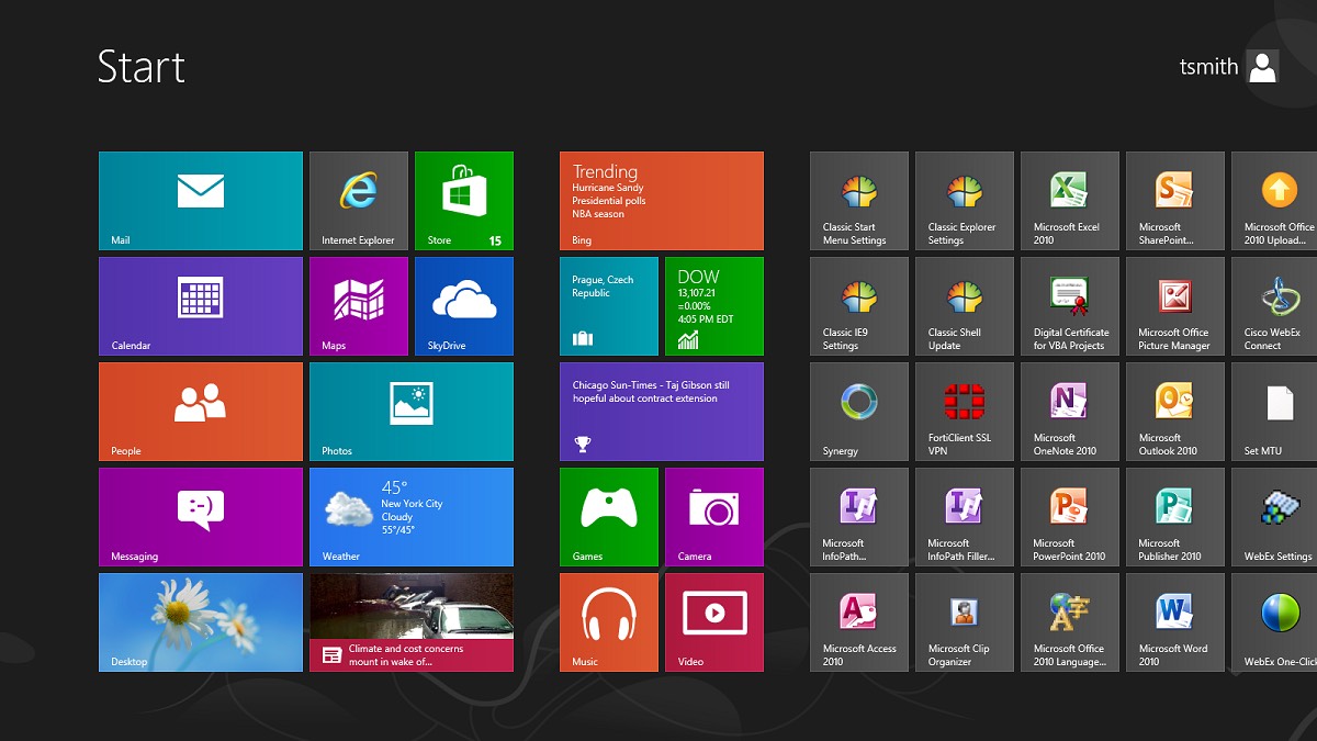
First, lets take a look at Windows 8 Start screen as default:
 While it is quite attractive, and very easy to get information quickly, it has flaws. For Windows Apps, there isn’t much of a problem, as they run full screen, and reflect this new design - the problems come when you, or applications, take you back to the traditional desktop. It really is like having two interfaces that you are switching back and forth between.
I found myself at the desktop 99% of the time, using internet explorer, firefox, Office 2012, vSphere client, etc… So, switching to this start screen each time to launch an application was a waste.
With ClassicShell, I love using Windows 8 now.
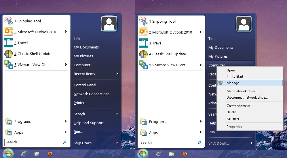
ClassicShell now puts a Start button in place, and allows full right-click capability. In a recent update, the Apps program list is now added, for easily launching apps from the Start menu as well.
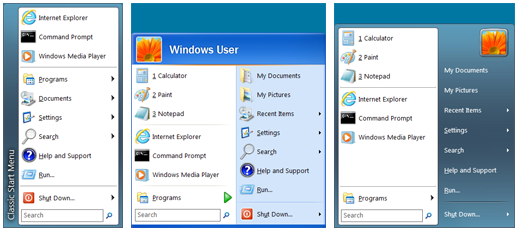
ClassicShell allows 3 different styles for the Start menu: Windows Classic, Windows XP, and Windows Vista / 7.
 The theme colors will be altered to match your windows color theme.
ClassicShell also includes usability updates to Windows Explorer, and to Internet Explorer. In Windows Explorer, ClassicShell adds a menu bar with common features, like cut, copy, and paste. In Internet Explorer, the page title is now in the title bar, as well as a couple other features.
If you are moving to Windows 8, or have a new machine with it pre-installed, I think ClassicShell is a necessity.

